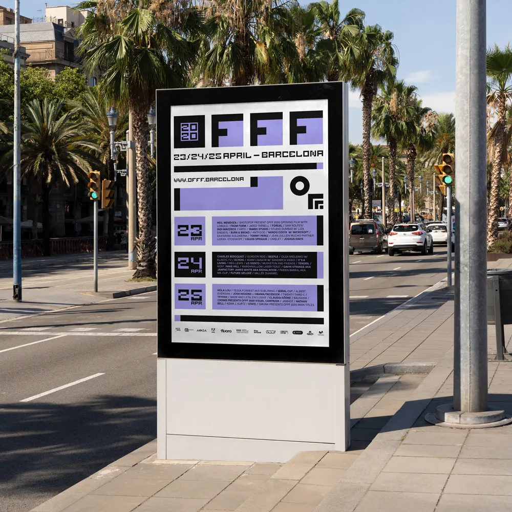
For my submission to the OFFF Festival 2021 poster call, N4MSTUDIO set out to explore the interplay between structure and disruption.
The poster is built on a strict, geometric grid, every element precisely aligned, with consistent spacing that creates a sense of balance, order, and clarity. This systematic layout formed the backbone of the design, a framework where every part relates to the whole.
Central to the poster is a custom typeface we developed specifically for this project. The type adds a personal, experimental layer to the composition, reinforcing the dialogue between form and function. Its shapes echo the geometric logic of the grid while introducing subtle quirks that break from convention.
Throughout the design, we introduced small ruptures in the system: a few elements intentionally breaking the grid, shifting in scale or shape. These moments of interruption create visual tension, inviting the viewer to oscillate between the calm of structure and the intrigue of deviation. Although the poster was not selected, it stands as a personal exploration of how far a system can be pushed—how geometry, typography, and composition can work together to create both harmony and surprise.